Hi guys!
I am so close to finishing exams. One week (2 exams) to go. I'm really looking forward to having some time to try some more nail art. I miss it. I just have a super quick post today of something I wore a couple of weeks ago. It's cold and wintry here and I just felt like a nice, simple crème for once. Essie 'Power Clutch' fit the bill perfectly.
'Power Clutch' is such a cool polish. It's a slate-y olive green that is fairly dark and brooding. It's a bit of a chameleon to look at. Sometimes it appeared more charcoal grey, sometimes more olive. Either way, I really like the colour. Perfect for the winter weather here (not that I ever go by the season).
The formula was really nice. This seems to be the formula that people always rave about Essie having. Unfortunately the first 2 Essie's I tried weren't great, formula-wise, so they scared me off a little. But since then, I have been using Essie's like this one and 'Bungle Jungle' and I now understand the love. 'Power Clutch' was nice and thin (not too much though) and levelled easily on the nail. It was also perfectly opaque in 2 coats.
Also a big thanks to Mimi (from Makeup Withdrawal) for getting this baby to me a while back :)
Showing posts with label Essie. Show all posts
Sunday, June 23, 2013
Wednesday, April 17, 2013
Daydream Surprise - Enchanted Polish & Butler Please - Essie
Holy moly!! 4 tests and 2 assignments down, 1 more due on Friday then a WHOLE week till the next thing's due. WOO. I can't believe how busy I have been. So much so that my nails have been naked more than not and they are getting long again! I am going to finish this post and file and paint them! I CAN'T WAIT!
Anyway... I threw some polishes on about a week and a bit ago for an engagement party and I loved them. This is Essie 'Butler Please' with Enchanted Polish 'Daydream Surprise' from the 'Love a Lot of Glitter' collection. Thanks Mimi for helping me get my mitts on 'Butler Please'.
OOOooooooeeeee 'Butler Please' was so hard to capture colour-correct. It is slightly more indigo in real life. On top of 'Butler Please' is Enchanted Polish 'Daydream Surprise'. I love the unexpected mix of glitters in this polish. The red glitters really pop against the whimsical iridescent pieces. All the different types and shapes of glitters all catch the light differently so it's always sparkling. I got so many comments on this combo.
These photos show 2 coats of 'Butler Please' with one coat of 'Daydream Surprise'. I just have to take a minute to say it is lucky 'Butler Please' is so gorgeous because its application pretty much sucks. It has a weird satiny finish that doesn't level out on the nail at all, leaving you with little baldy thin bits and then gloopy thick bits. Its one saving factor is that it only needs 2 coats for full opacity so at least after 2 coats the drama is over. I think the colour makes it worth the trouble for me, but some people might not feel the same? 'Daydream Surprise' was easy peesy, one coat, no dabbing, packed full of glitter.
Enchanted Polish is available from lots of places online. I generally purchase mine from Harlow & Co. but they are also available from Llarowe and Mei Mei's Signatures and of course from Enchanted Polish among other places.
Anyway... I threw some polishes on about a week and a bit ago for an engagement party and I loved them. This is Essie 'Butler Please' with Enchanted Polish 'Daydream Surprise' from the 'Love a Lot of Glitter' collection. Thanks Mimi for helping me get my mitts on 'Butler Please'.
OOOooooooeeeee 'Butler Please' was so hard to capture colour-correct. It is slightly more indigo in real life. On top of 'Butler Please' is Enchanted Polish 'Daydream Surprise'. I love the unexpected mix of glitters in this polish. The red glitters really pop against the whimsical iridescent pieces. All the different types and shapes of glitters all catch the light differently so it's always sparkling. I got so many comments on this combo.
These photos show 2 coats of 'Butler Please' with one coat of 'Daydream Surprise'. I just have to take a minute to say it is lucky 'Butler Please' is so gorgeous because its application pretty much sucks. It has a weird satiny finish that doesn't level out on the nail at all, leaving you with little baldy thin bits and then gloopy thick bits. Its one saving factor is that it only needs 2 coats for full opacity so at least after 2 coats the drama is over. I think the colour makes it worth the trouble for me, but some people might not feel the same? 'Daydream Surprise' was easy peesy, one coat, no dabbing, packed full of glitter.
Enchanted Polish is available from lots of places online. I generally purchase mine from Harlow & Co. but they are also available from Llarowe and Mei Mei's Signatures and of course from Enchanted Polish among other places.
Labels:
Blue
,
Enchanted Polish
,
Essie
,
Glitter
,
Indie
Wednesday, March 13, 2013
Polish Days: Vintage
It's Polish Days time again! For the first time since I started participating in Polish Days, I really struggled with the theme. This month's theme is Vintage... Hannah suggests that you could take the theme to mean using a vintage polish, or taking a decade or trend or anything really, so long as there is some connection with the past as your inspiration. Seems easy enough right... Wrong! I could not think. I often do stamping that reminds me of old-fashioned wallpaper etc, but I wanted to do something different and as I always use Polish Days as a way to make sure I do some nail art, I didn't want to just swatch a vintage polish. In the end I googled the word vintage and this is what I came up with..,
This totally reminds me of an old-fashioned day at the beach. I actually really like the way this turned out with the stripes and everything.
This was my inspiration image. As I was scrolling down through google images, I instantly fell in love with this and knew I wanted my mani to come from this.
Here are my nails pre stamping. I love the stripes. Please excuse the fact that only two of my nails are top coated! I'm not sure why I thought it was a good idea to take photos before I did the other two??
Polishes I used were OPI 'My Boyfriend Scales Walls' as the base on all nails. I did the stripes using striping tape from Born Pretty Store with OPI 'Steady As She Rose' and China Glaze 'Aquadelic'. My ring finger was stamped using BM-309 with a-england 'Galahad' and BM-09 with Essie 'School of Hard Rocks'.
Thanks Hannah for another great Polish Days! Make sure you check out what all the other lovelies have made of this theme...
Labels:
Bundle Monster
,
China Glaze
,
Essie
,
Green
,
OPI
,
Pink
,
Polish Days
,
Stamping
,
Striping Tape
Wednesday, July 18, 2012
Splatter Mani Take One...
Last Sunday, the last day of my holidays, I thought I'd like to try one more technique. So splatter mani it is...
I have to say, this was just as fun but not quite as messy as you all say it is to do! I took forever to decide which colours would go perfectly together and I ended up back with my old favourites, yes of course, I used 4 a-englands and a little Essie to top it off. On these four nails, left to right, all a-england - 'King Arthur', 'Avalon', 'Perceval' and 'Order Of The Garter'. Underneath is Sally Hansen 'White On', two coats.
This photo was taken mainly without top coat. There is top coat on my index finger, but it smeared the colour so the rest is without. I love how everything has a matte sort of look about it. All the other pictures are with top coat but a different one (on the index finger is Cult Nails 'Wicked Fast' and the rest are using Essie 'Good To Go').
I know this is a weird picture but I just popped my left thumb in here so I could show you all the colours together! On my thumb is Essie 'Trophy Wife'.
I really loved this fun look and will definitely have to try it again some time. The only thing was that I kept doing double takes, as my middle finger looked like I had ripped off a large piece of cuticle out the corner of my eye! I think these a-england colours played so nicely with Essie's 'Trophy Wife'.
And to make life a little sweeter, the ever-generous Adina has a massive promotion happening from now until the 22nd July and all the Mythicals are only £5 with free shipping, so hop on over to the a-england website and get shopping. The three polishes on the left are all from The Mythicals collection.
I have to say, this was just as fun but not quite as messy as you all say it is to do! I took forever to decide which colours would go perfectly together and I ended up back with my old favourites, yes of course, I used 4 a-englands and a little Essie to top it off. On these four nails, left to right, all a-england - 'King Arthur', 'Avalon', 'Perceval' and 'Order Of The Garter'. Underneath is Sally Hansen 'White On', two coats.
This photo was taken mainly without top coat. There is top coat on my index finger, but it smeared the colour so the rest is without. I love how everything has a matte sort of look about it. All the other pictures are with top coat but a different one (on the index finger is Cult Nails 'Wicked Fast' and the rest are using Essie 'Good To Go').
I know this is a weird picture but I just popped my left thumb in here so I could show you all the colours together! On my thumb is Essie 'Trophy Wife'.
I really loved this fun look and will definitely have to try it again some time. The only thing was that I kept doing double takes, as my middle finger looked like I had ripped off a large piece of cuticle out the corner of my eye! I think these a-england colours played so nicely with Essie's 'Trophy Wife'.
And to make life a little sweeter, the ever-generous Adina has a massive promotion happening from now until the 22nd July and all the Mythicals are only £5 with free shipping, so hop on over to the a-england website and get shopping. The three polishes on the left are all from The Mythicals collection.
Friday, June 22, 2012
Sea Creature - The Hungry Asian - & School Of Hard Rocks - Essie
I have never been so excited about a glitter in all my life. As I put 'Sea Creature' on, I was all "ooohhh aaahhh"... Let me attempt to show you why...
But first I'll just quickly show you what was underneath this amazing glitter. I used Essie 'School Of Hard Rocks' as my base colour for this mani.
'School Of Hard Rocks' is a dusty looking dark teal colour. Really pretty actually. I love how the colour is somewhat greyed out and a bit muted.
These photos show 'School Of Hard Rocks' without top coat and you can see that it's gorgeously shiny. The colour reminds me a lot of raw greenstone.
This is 'Sea Creature' from The Hungry Asian. I actually got this a little bit ago. I originally set out to get 'Sneeze Breeze' (which I did also get :) ) and I saw this and just chucked it in my cart thinking the bottle shot looked quite nice. Well thank goodness I did! Like I said at the top of this post, I've never been so in love with a glitter.
'Sea Creature' is made up of little black matte hexes, tiny green glitter, slightly larger pinky-purple hexes and larger blue hexes. It's my absolute favourite mix of glitters of all the glitters I own.
I love the pink bits of glitter. They're a really surprising addition to this polish to me, but they just catch your eye perfectly and really give this mix of glitters that little extra je ne sais quoi.
Here's the macro. Isn't 'Sea Creature' brilliant?!
To the formulas... 'School Of Hard Rocks' was a simple two coater. The only little niggle I have with this polish is that it was really thin, the type of watery polish that wants to pool in your cuticles, so a bit of careful and patient application is needed. As for 'Sea Creature'... So easy to apply. The glitter stayed exactly where it was put and was so simple to get a nice even spread. I used 2 thin coats of 'Sea Creature' and I think it's great that thinner coats can be used so that you are in full control of how much glitter you end up with on your nails. It was a pretty hungry fella though, so you are seeing 3 coats of Cult Nails 'Wicked Fast' on top. 'Wicked Fast' is a really awesome but fairly thin top coat, so if you use something like Seche Vite, you shouldn't need so many coats at all to get it smooth.
'School Of Hard Rocks' can be purchased from anywhere that sells Essie's (Kiwi's - quite a few pharmacies, Smith & Caughey and Candy Girl (which is by far the cheapest)), and 'Sea Creature' can be purchased from The Hungry Asian Etsy store for $9.25 USD (apparently $12 NZD according to Etsy) and I have just checked and I think 'Sea Creature' is in stock right now! Check out her other beauties too :)
These photos show 'School Of Hard Rocks' without top coat and you can see that it's gorgeously shiny. The colour reminds me a lot of raw greenstone.
This is 'Sea Creature' from The Hungry Asian. I actually got this a little bit ago. I originally set out to get 'Sneeze Breeze' (which I did also get :) ) and I saw this and just chucked it in my cart thinking the bottle shot looked quite nice. Well thank goodness I did! Like I said at the top of this post, I've never been so in love with a glitter.
'Sea Creature' is made up of little black matte hexes, tiny green glitter, slightly larger pinky-purple hexes and larger blue hexes. It's my absolute favourite mix of glitters of all the glitters I own.
I love the pink bits of glitter. They're a really surprising addition to this polish to me, but they just catch your eye perfectly and really give this mix of glitters that little extra je ne sais quoi.
Here's the macro. Isn't 'Sea Creature' brilliant?!
To the formulas... 'School Of Hard Rocks' was a simple two coater. The only little niggle I have with this polish is that it was really thin, the type of watery polish that wants to pool in your cuticles, so a bit of careful and patient application is needed. As for 'Sea Creature'... So easy to apply. The glitter stayed exactly where it was put and was so simple to get a nice even spread. I used 2 thin coats of 'Sea Creature' and I think it's great that thinner coats can be used so that you are in full control of how much glitter you end up with on your nails. It was a pretty hungry fella though, so you are seeing 3 coats of Cult Nails 'Wicked Fast' on top. 'Wicked Fast' is a really awesome but fairly thin top coat, so if you use something like Seche Vite, you shouldn't need so many coats at all to get it smooth.
'School Of Hard Rocks' can be purchased from anywhere that sells Essie's (Kiwi's - quite a few pharmacies, Smith & Caughey and Candy Girl (which is by far the cheapest)), and 'Sea Creature' can be purchased from The Hungry Asian Etsy store for $9.25 USD (apparently $12 NZD according to Etsy) and I have just checked and I think 'Sea Creature' is in stock right now! Check out her other beauties too :)
Labels:
Blue
,
Crème
,
Essie
,
Glitter
,
Green
,
Indie
,
Matte Glitter
,
Teal
,
The Hungry Asian
Monday, May 14, 2012
Coral Comparison
It's that time again, comparison time. This time I will show you a little coral comparison. I love corals. I think a good coral can look good on anyone, but I have to say I have a few that seemed to look a little similar... and I was kind of right about that. I'll let you see for yourself...
These photos are with base coat but without any top coat.
From left to right: Pinky - OPI 'Big Hair... Big Nails', ring - OPI 'Red Lights Ahead... Where?', middle - OPI 'My Chihuahua Bites' and index - Essie 'Peach Daiquiri'.
As you can see there aren't any dupes here but they are all fairly similar. The main difference of course being that 'Big Hair... Big Nails' is a jelly so will naturally look a bit different.
'Red Lights Ahead... Where?', on my ring finger, seems to lean a little more red than the others and 'Peach Daiquiri' on my index finger, a little more pink/salmon. I think 'Red Lights Ahead... Where?' is such a perfect colour. Really should wear that as a full mani sooner rather than later, I'm thinking.
I just had to show you this one last photo as this is one coat of each of the crème polishes. The two OPI's here are completely opaque in one coat and Essie 'Peach Daiquiri' is not far behind. I love these kinds of polishes because it means my second coat can just be there to shine everything up and fix any funny cuticle goings on :)
To the formula... The top two photos are showing two coats each of 'Peach Daiquiri', 'Red Lights Ahead... Where?', and 'My Chihuahua Bites', with three coats of 'Big Hair... Big Nails' (not bad for a jelly)! These polishes were all so easy to work with (see the one coat photo!). The only one that nearly caused me a tiny bit of grief, was 'My Chihuahua Bites'. It's one of my older polishes and has thickened up and tends to separate. Nothing that's not fixable with a few drops of thinner though, I'm sure. Anyway, I hope this helped someone and if not I hope you liked looking at these pretty polishes all lined up :)
These polishes are all currently available. For the kiwis, the three OPI's are available on Candy Girl for $18.95 (or of course at Farmers etc for around $26.90) and I got the Essie polish from Smith and Caughey (I got it in their sale for super cheap ($12 or something) so I'm not sure how much they are normally.
These photos are with base coat but without any top coat.
From left to right: Pinky - OPI 'Big Hair... Big Nails', ring - OPI 'Red Lights Ahead... Where?', middle - OPI 'My Chihuahua Bites' and index - Essie 'Peach Daiquiri'.
As you can see there aren't any dupes here but they are all fairly similar. The main difference of course being that 'Big Hair... Big Nails' is a jelly so will naturally look a bit different.
'Red Lights Ahead... Where?', on my ring finger, seems to lean a little more red than the others and 'Peach Daiquiri' on my index finger, a little more pink/salmon. I think 'Red Lights Ahead... Where?' is such a perfect colour. Really should wear that as a full mani sooner rather than later, I'm thinking.
I just had to show you this one last photo as this is one coat of each of the crème polishes. The two OPI's here are completely opaque in one coat and Essie 'Peach Daiquiri' is not far behind. I love these kinds of polishes because it means my second coat can just be there to shine everything up and fix any funny cuticle goings on :)
To the formula... The top two photos are showing two coats each of 'Peach Daiquiri', 'Red Lights Ahead... Where?', and 'My Chihuahua Bites', with three coats of 'Big Hair... Big Nails' (not bad for a jelly)! These polishes were all so easy to work with (see the one coat photo!). The only one that nearly caused me a tiny bit of grief, was 'My Chihuahua Bites'. It's one of my older polishes and has thickened up and tends to separate. Nothing that's not fixable with a few drops of thinner though, I'm sure. Anyway, I hope this helped someone and if not I hope you liked looking at these pretty polishes all lined up :)
These polishes are all currently available. For the kiwis, the three OPI's are available on Candy Girl for $18.95 (or of course at Farmers etc for around $26.90) and I got the Essie polish from Smith and Caughey (I got it in their sale for super cheap ($12 or something) so I'm not sure how much they are normally.
Tuesday, May 8, 2012
Dating A Royal - OPI (Jelly Sandwich!)
I have my laptop back! And that means I got all my photos back. :) So I will be showing you today my first attempt at a jelly sandwich. I decided that I really wanted to wear OPI's 'Dating A Royal' a little while back, but I felt like wearing something more than a single colour. 'Dating A Royal' is one of those jelly/crème hybrids. Definitely not a crème, but to my eyes, I don't think it's a full jelly-jelly either. Anyway, enough chit chatting, let me just show you and you can decide for yourself...
To start with, I did 2 coats of 'Dating A Royal', it still looked a bit see through but I was putting lots on top so that's OK. Next I layered one coat of OPI 'Last Friday Night', then one coat of Essie 'Shine Of The Times'. As you can see, at this point, it's quite an assault on your senses! The glitter is pretty full on...
I then added one more THIN layer of 'Dating A Royal', et voilà... One Jelly Sandwich.
A couple more photos, both taken in full sunlight. The overall look was reasonably subtle, but to be honest I really loved it.
'Dating A Royal' is such an easy polish to apply (as are most jellys I've tried). It's so smooth and spreads effortlessly on the nail. Of course it dries super glossy, but with the glitter underneath, top coat is needed to smooth out the gritty texture some. I used a nice thick coat of Essie 'Good To Go' but if you want no gritty-ness, you will likely need more than just that. I had lots of fun with this sandwich and so I will definitely be trying this again with some other jellys.
To start with, I did 2 coats of 'Dating A Royal', it still looked a bit see through but I was putting lots on top so that's OK. Next I layered one coat of OPI 'Last Friday Night', then one coat of Essie 'Shine Of The Times'. As you can see, at this point, it's quite an assault on your senses! The glitter is pretty full on...
I then added one more THIN layer of 'Dating A Royal', et voilà... One Jelly Sandwich.
A couple more photos, both taken in full sunlight. The overall look was reasonably subtle, but to be honest I really loved it.
'Dating A Royal' is such an easy polish to apply (as are most jellys I've tried). It's so smooth and spreads effortlessly on the nail. Of course it dries super glossy, but with the glitter underneath, top coat is needed to smooth out the gritty texture some. I used a nice thick coat of Essie 'Good To Go' but if you want no gritty-ness, you will likely need more than just that. I had lots of fun with this sandwich and so I will definitely be trying this again with some other jellys.
Thursday, April 19, 2012
Bungle Jungle - Essie
It's study avoidance time! What better way to procrastinate than with my blog? Todays polish is worth it though, I have Essie 'Bungle Jungle' to show you and boy is it pretty. As far as I can tell, this polish was originally released in the Winter '06 collection 'Hot For Spots', but I got it for half price (about $12.50) in the Smith and Caughey sale and for once in my life I bought it having never even heard of it before (thank goodness I did).
See! What did I tell you! 'Bungle Jungle' is the most eye-searingly gorgeous red that I own. It's such an intense cherry red, the kind that will certainly make people notice your nails.
'Bungle Jungle' has this subtle gold shimmer all through it that appears fairly obvious in the bottle but is particularly shy on the nail. In the right light though, this beauty shines spectacularly.
In low light, everything just becomes even richer. This polish seems to have so much depth to it! And you can see quite clearly what I meant about the gold shimmer in the bottle.
This is how 'Bungle Jungle' looks in most lights. The shimmer is not obvious but as I said, it just gives the polish a certain depth and a little bit of an edge.
A sneaky close-up look at this reveals that shimmer. It almost has a slight iridescent quality to it... Or maybe that's just my eyes? Either way... I love it.
Oh dear another gushy post from me, but I hope you can all see that this polish deserves every single gush. I secretly love red polish and this one is quite possibly my favourite. At first I was disappointed that the shimmer didn't really transfer onto the nail but now, I just love it the way it is. How can I make this even better?... The formula... 'Bungle Jungle' was a pleasure to apply. Perfectly thin and easy flowing. This is the Essie formula that I seem to always hear about but hadn't really experienced. I used three coats on my right hand (as seen in the photos) but I left it at two coats on my left hand and that was enough. I used Orly 'Bonder' as my base coat and Essie 'Good To Go' on top.
P.S. I love this polish so much, I couldn't help but make the photos extra-large for your viewing pleasure! :)
See! What did I tell you! 'Bungle Jungle' is the most eye-searingly gorgeous red that I own. It's such an intense cherry red, the kind that will certainly make people notice your nails.
'Bungle Jungle' has this subtle gold shimmer all through it that appears fairly obvious in the bottle but is particularly shy on the nail. In the right light though, this beauty shines spectacularly.
In low light, everything just becomes even richer. This polish seems to have so much depth to it! And you can see quite clearly what I meant about the gold shimmer in the bottle.
This is how 'Bungle Jungle' looks in most lights. The shimmer is not obvious but as I said, it just gives the polish a certain depth and a little bit of an edge.
A sneaky close-up look at this reveals that shimmer. It almost has a slight iridescent quality to it... Or maybe that's just my eyes? Either way... I love it.
Oh dear another gushy post from me, but I hope you can all see that this polish deserves every single gush. I secretly love red polish and this one is quite possibly my favourite. At first I was disappointed that the shimmer didn't really transfer onto the nail but now, I just love it the way it is. How can I make this even better?... The formula... 'Bungle Jungle' was a pleasure to apply. Perfectly thin and easy flowing. This is the Essie formula that I seem to always hear about but hadn't really experienced. I used three coats on my right hand (as seen in the photos) but I left it at two coats on my left hand and that was enough. I used Orly 'Bonder' as my base coat and Essie 'Good To Go' on top.
P.S. I love this polish so much, I couldn't help but make the photos extra-large for your viewing pleasure! :)
Saturday, March 24, 2012
Dark Reds - Comparison
Today I have for you all another comparison. This time dark reds. I am an absolute sucker for red polish and in the winter time, dark reds are perfect. Let's get straight on with it...
Left to right; OPI 'Royal Rajah Ruby', China Glaze 'Thunderbird', OPI 'I'm Not Really A Waitress' and Essie 'Swing Velvet'. You can see pretty easily that we have none that look the same, although I have have to say in some lights 'I'm Not Really A Waitress' and 'Thunderbird' did look similar (see the last photo). They all have a gorgeous shimmer that is quite obvious in pretty much all light.
'Royal Rajah Ruby' is a much browner toned burgundy than the others and 'Swing Velvet' is more plummy coloured. Something that really surprised me, I always thought of 'I'm Not Really A Waitress' as a burnt, rusty red, but when I put it on next to all of these, it was verging on looking cherry red!
This is a close-up of the middle two (left - 'Thunderbird', right - 'I'm Not Really A Waitress'). They were by far the closest colour match of the four, although by no means the same. The shimmer in 'Thunderbird' is a bit coarser and a little more obvious. It also has a slightly rustier appearance than 'I'm Not Really A Waitress'. As far as needing both in your stash... Well if you're like me then you definitely need both as they're not dupes (although 'Thunderbird' is actually my Mum's), but if you are unlike me and have any self-control, you probably don't :) Both applied like a dream but personally I prefer OPI's brushes so I would probably reach for that more.
Speaking of formulas... 'Royal Rajah Ruby' had pretty usual OPI good application. As I said, the middle two were great. Both 'Thunderbird' and 'I'm Not Really A Waitress' were perfectly self-levelling and applied like butter. 'Swing Velvet' took a little more patience (I find this with a lot of Essie polishes), not bad though. All were two coats except 'Swing Velvet' as I messed it up a little and had to smooth it out with a third coat. With a slightly steadier hand, two coats would have been fine. The three polishes to the left are all readily available - that's 'Royal Rajah Ruby', 'Thunderbird' and 'I'm Not Really A Waitress'. For the kiwis out there, you can get all three of these on Candy Girl. As for the Essie polish, 'Swing Velvet', I don't know how accessible that is. I've not been able to find out a lot about it to be honest. I think it was part of Essie's Classic Collection? If anyone out there happens to know, I'd love to find out as it's a really beautiful polish that I might have to get my mittens on (it's my Mum's too).
Left to right; OPI 'Royal Rajah Ruby', China Glaze 'Thunderbird', OPI 'I'm Not Really A Waitress' and Essie 'Swing Velvet'. You can see pretty easily that we have none that look the same, although I have have to say in some lights 'I'm Not Really A Waitress' and 'Thunderbird' did look similar (see the last photo). They all have a gorgeous shimmer that is quite obvious in pretty much all light.
'Royal Rajah Ruby' is a much browner toned burgundy than the others and 'Swing Velvet' is more plummy coloured. Something that really surprised me, I always thought of 'I'm Not Really A Waitress' as a burnt, rusty red, but when I put it on next to all of these, it was verging on looking cherry red!
This is a close-up of the middle two (left - 'Thunderbird', right - 'I'm Not Really A Waitress'). They were by far the closest colour match of the four, although by no means the same. The shimmer in 'Thunderbird' is a bit coarser and a little more obvious. It also has a slightly rustier appearance than 'I'm Not Really A Waitress'. As far as needing both in your stash... Well if you're like me then you definitely need both as they're not dupes (although 'Thunderbird' is actually my Mum's), but if you are unlike me and have any self-control, you probably don't :) Both applied like a dream but personally I prefer OPI's brushes so I would probably reach for that more.
Speaking of formulas... 'Royal Rajah Ruby' had pretty usual OPI good application. As I said, the middle two were great. Both 'Thunderbird' and 'I'm Not Really A Waitress' were perfectly self-levelling and applied like butter. 'Swing Velvet' took a little more patience (I find this with a lot of Essie polishes), not bad though. All were two coats except 'Swing Velvet' as I messed it up a little and had to smooth it out with a third coat. With a slightly steadier hand, two coats would have been fine. The three polishes to the left are all readily available - that's 'Royal Rajah Ruby', 'Thunderbird' and 'I'm Not Really A Waitress'. For the kiwis out there, you can get all three of these on Candy Girl. As for the Essie polish, 'Swing Velvet', I don't know how accessible that is. I've not been able to find out a lot about it to be honest. I think it was part of Essie's Classic Collection? If anyone out there happens to know, I'd love to find out as it's a really beautiful polish that I might have to get my mittens on (it's my Mum's too).
Labels:
China Glaze
,
Comparison
,
Essie
,
OPI
,
Red
Tuesday, February 14, 2012
Valentine's Day Mani
Happy Valentine's Day!
So I thought now that I have a blog, I might get into the holiday spirit a bit more and so I decided do a bit of a Valentine's day theme for the weekend.
I started off with 3 coats of OPI's 'Mod About You' from the 2006 brights collection 'Brighter By The Dozen', though 'Mod About You' is now one of OPI's classic Brights By OPI colours.
'Mod About You' is a whited-out pink shade that just makes me feel like a walking, talking Barbie! Not necessarily in an entirely bad way either :) It's just fairly in-your-face considering it's a pastel pink.
In indirect light, 'Mod About You' becomes a little warmer and slightly pinker, which is really pretty.
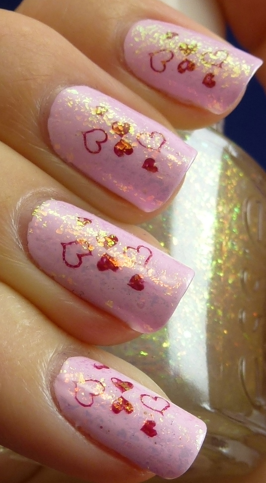
Next, I stamped hearts using Konad plate m3. I used OPI's 'Manicurist Of Seville' as my stamping polish. I have to say that it's one of my all time favourite polishes and it stamped pretty well! I found it impossible to get the filled in hearts to be actually filled in, as you can see, but I didn't really mind. It reminded me of when I used to draw balloons (or hearts) over all my school books as a kid and I always had to add the little line for where the light hit the balloon (or the heart). I felt like, at this point, my nails looked pretty boring and were clearly missing something... Enter Essie 'Shine Of The Times'...
In direct light (see my ring finger), 'Shine Of The Times' appears to give a slightly purple tinged texture rather than a full rainbow effect. When light hits it from more of an angle (see my index finger), you get the full glory of 'Shine Of the Times' and this is just what I thought was missing from this manicure.
So I thought now that I have a blog, I might get into the holiday spirit a bit more and so I decided do a bit of a Valentine's day theme for the weekend.
I started off with 3 coats of OPI's 'Mod About You' from the 2006 brights collection 'Brighter By The Dozen', though 'Mod About You' is now one of OPI's classic Brights By OPI colours.
'Mod About You' is a whited-out pink shade that just makes me feel like a walking, talking Barbie! Not necessarily in an entirely bad way either :) It's just fairly in-your-face considering it's a pastel pink.
In indirect light, 'Mod About You' becomes a little warmer and slightly pinker, which is really pretty.
Next, I stamped hearts using Konad plate m3. I used OPI's 'Manicurist Of Seville' as my stamping polish. I have to say that it's one of my all time favourite polishes and it stamped pretty well! I found it impossible to get the filled in hearts to be actually filled in, as you can see, but I didn't really mind. It reminded me of when I used to draw balloons (or hearts) over all my school books as a kid and I always had to add the little line for where the light hit the balloon (or the heart). I felt like, at this point, my nails looked pretty boring and were clearly missing something... Enter Essie 'Shine Of The Times'...
In direct light (see my ring finger), 'Shine Of The Times' appears to give a slightly purple tinged texture rather than a full rainbow effect. When light hits it from more of an angle (see my index finger), you get the full glory of 'Shine Of the Times' and this is just what I thought was missing from this manicure.
All of the colours seen in 'Shine Of The Times' were so incredibly hard to photograph! The photo on the right is about as good as it gets in showing you the elusive bright red/copper that appears every now and again. To see more of this absolute beauty of a polish, have a look at my previous post of it.
Overall I'm pretty happy with how my Valentine's nails came out. This manicure is so unlike me in so many ways, but I've really enjoyed wearing it. But now to the business side of things... The formula. 'Mod About You' is certainly not my favourite polish to apply, though it's not the worst. You just have to be a little patient and take a little more care than usual. Typical pale polish application - beware of streaks and bald patches. I had to use 3 coats in order to get full opacity and get rid of streaks. The photos of 'Mod about You', on its own and with just the stamps on, are without top coat and as you can see, a top coat would add a bit of much needed shine to this polish. 'Manicurist Of Seville', as I stated earlier, was a fairly successful stamping polish. It's beautifully opaque and I think it has just the right amount of red to sit nicely with 'Mod About You'. I used a fairly thick single coat of 'Shine Of The Times' and that was easy to apply and spread evenly. Underneath all of this, I used Essie 'Millionails' and on top I used Sally Hansen's 'Insta-Dri'. 'Shine Of The Times' can be prone to eating up top coat, leaving a gritty texture, so I decided to go with this slightly thicker top coat and it still has a slight texture to the touch - though I'm not too worried. Hope you are all having a lovely Valentine's Day! I actually celebrated yesterday as I'm working tonight :)
Wednesday, February 8, 2012
Essie - Lapis Of Luxury
So I thought I'd try another Essie after the last one was such a trouble-maker... (Also the weather was still WAY too overcast to really show off any more of 'The Legends'). This time I tried Essie's 'Lapis Of Luxury' from the 2010 Resort Collection...
Isn't it beautiful! 'Lapis Of Luxury' is a gorgeous periwinkle, verging on cornflower, blue.
I've spent so much time just staring at this colour on my nails. It's a very wearable blue. Bright and happy but not too out-there. I suddenly realised, while I was typing this, that this is the exact colour of the 1st and 2nd year classical uniform from when I was training as a dancer! (The colour of the uniform was called 'Lunar Blue').
In this photo, taken with a flash, the blue really comes through and everything appears to soften slightly.
In shade, 'Lapis Of Luxury' becomes more saturated and slightly more purple leaning.
In whatever light this polish is in, it always looks so pretty. If only the formula were so fantastic... Once again Essie has been a toughie formula-wise. This polish was so thin! This is 4 coats and on some fingers it's still very sheer. I had to really coax this onto my nails and it took a huge amount of effort to make it even look halfway decent. If you are not into taking a long time to do your nails, maybe this isn't right for you. If you don't mind that, then definitely get this beauty! In saying all this, I have read a lot of reviews for this polish and most say how fantastic the formula is - 2 easy coats. I'm just wondering whether perhaps my Essie polishes weren't stored well before they got to me? Who knows. All I know is that I am loving this colour so much that I don't care how hard it is to apply, I will definitely wear it lots more. I think next time I will try fewer slightly thicker coats and see how that goes.
Just as a quick side-note... I have noticed a fair amount of confusion on the internet as to the name of this beauty. My bottle certainly is called Lapis Of Luxury but some insist the name is Lapiz Of Luxury. I've hunted around and found the answer... When Wal-Mart got the Essie range, they decided they needed to change a bunch of the names (including Lapis Of Luxury) to be more "family-friendly". For a bit more about this silliness, have a look at this blog.
Isn't it beautiful! 'Lapis Of Luxury' is a gorgeous periwinkle, verging on cornflower, blue.
I've spent so much time just staring at this colour on my nails. It's a very wearable blue. Bright and happy but not too out-there. I suddenly realised, while I was typing this, that this is the exact colour of the 1st and 2nd year classical uniform from when I was training as a dancer! (The colour of the uniform was called 'Lunar Blue').
In this photo, taken with a flash, the blue really comes through and everything appears to soften slightly.
In shade, 'Lapis Of Luxury' becomes more saturated and slightly more purple leaning.
In whatever light this polish is in, it always looks so pretty. If only the formula were so fantastic... Once again Essie has been a toughie formula-wise. This polish was so thin! This is 4 coats and on some fingers it's still very sheer. I had to really coax this onto my nails and it took a huge amount of effort to make it even look halfway decent. If you are not into taking a long time to do your nails, maybe this isn't right for you. If you don't mind that, then definitely get this beauty! In saying all this, I have read a lot of reviews for this polish and most say how fantastic the formula is - 2 easy coats. I'm just wondering whether perhaps my Essie polishes weren't stored well before they got to me? Who knows. All I know is that I am loving this colour so much that I don't care how hard it is to apply, I will definitely wear it lots more. I think next time I will try fewer slightly thicker coats and see how that goes.
Just as a quick side-note... I have noticed a fair amount of confusion on the internet as to the name of this beauty. My bottle certainly is called Lapis Of Luxury but some insist the name is Lapiz Of Luxury. I've hunted around and found the answer... When Wal-Mart got the Essie range, they decided they needed to change a bunch of the names (including Lapis Of Luxury) to be more "family-friendly". For a bit more about this silliness, have a look at this blog.
Sunday, February 5, 2012
Essie - Cocktail Bling
I was thinking it was about time I actually tried an Essie polish (a colour rather than their nail treatments or special effect top coat). So I bought a couple of Essie polishes from Candy Girl and although we had a minor courier issue (too lazy to buzz the apartment so just left the "wasn't home" card in the letter box), 4 more days on, they finally arrived. I got three polishes - 'Lapis Of Luxury', 'School Of Hard Rocks' and 'Cocktail Bling' - I also got my first China Glaze ('Four Leaf Clover'). So today I have the first of them... Essie 'Cocktail Bling'.
'Cocktail Bling' is the title polish of the 2011 Winter collection for Essie. It's one of those polishes where it depends who you are and where you are as to what colour you would call it. I say it's a greyed lavender/blue crème (in other words I have no idea)! Every time I turn back to look at the polish (or the photos) I think "oh yes, it's definitely... *insert several different colours here*"...
Lots of bloggers have said it's grey with blue hues etc, but personally I lean more to it being a dusty blue/purple with grey hues.
In this photo you can get a tiny preview of how this polish starts to shift colour with varying light. My pinky finger is in more direct light and the colour becomes a slightly more stark grey, head over to the middle/ index fingers and you get a warmer more purple leaning blue. Whatever you decide this colour is, I think we can all agree that it's really pretty. I love these soft, easy-to-wear colours that suit everyone on every occasion.
To the formula... Before we get too excited about how pretty this colour is I have to admit that it was a complete rat-bag to apply! I have never had so much difficulty with a polish. This is three coats. The first coat went on so thin and VERY streaky, I didn't think much of it as this is pretty usual for a pastel polish. Second coat similar story only this time it was really hard to spread the polish on the nail. Third coat... Ridiculous. Bald patches on some parts and massive unspread chunks of polish on other parts. I'm not quite sure what the solution is here as all the reviews I've read of this polish say "great formula, 2 easy coats". As usual, I'm not prepared to write this polish off (formula-wise) as I always suspect it's something wrong with my technique rather than the formula of such a well regarded polish brand. Perhaps next time I'll aim for 2 slightly thicker coats rather than 3-4 thin ones... I'll let you know how that goes when I eventually try it again. I used Essie 'Millionails' as my base coat and Essie 'Good To Go' as the top coat. These photos were all taken under Auckland's VERY grey and overcast "summer" sky, hence the lack of real sunlight photos.
'Cocktail Bling' is the title polish of the 2011 Winter collection for Essie. It's one of those polishes where it depends who you are and where you are as to what colour you would call it. I say it's a greyed lavender/blue crème (in other words I have no idea)! Every time I turn back to look at the polish (or the photos) I think "oh yes, it's definitely... *insert several different colours here*"...
Lots of bloggers have said it's grey with blue hues etc, but personally I lean more to it being a dusty blue/purple with grey hues.
In this photo you can get a tiny preview of how this polish starts to shift colour with varying light. My pinky finger is in more direct light and the colour becomes a slightly more stark grey, head over to the middle/ index fingers and you get a warmer more purple leaning blue. Whatever you decide this colour is, I think we can all agree that it's really pretty. I love these soft, easy-to-wear colours that suit everyone on every occasion.
To the formula... Before we get too excited about how pretty this colour is I have to admit that it was a complete rat-bag to apply! I have never had so much difficulty with a polish. This is three coats. The first coat went on so thin and VERY streaky, I didn't think much of it as this is pretty usual for a pastel polish. Second coat similar story only this time it was really hard to spread the polish on the nail. Third coat... Ridiculous. Bald patches on some parts and massive unspread chunks of polish on other parts. I'm not quite sure what the solution is here as all the reviews I've read of this polish say "great formula, 2 easy coats". As usual, I'm not prepared to write this polish off (formula-wise) as I always suspect it's something wrong with my technique rather than the formula of such a well regarded polish brand. Perhaps next time I'll aim for 2 slightly thicker coats rather than 3-4 thin ones... I'll let you know how that goes when I eventually try it again. I used Essie 'Millionails' as my base coat and Essie 'Good To Go' as the top coat. These photos were all taken under Auckland's VERY grey and overcast "summer" sky, hence the lack of real sunlight photos.
Saturday, January 21, 2012
Essie - Shine Of The Times and OPI - Over The Taupe
I got my first flakie! I'm so excited about this polish! I've have been dreaming of owning Essie 'Shine Of The Times' since it first was blogged about last year, but unfortunately New Zealand doesn't really get much in the way of new collections by Essie. I've been keeping an eye out online for this pretty polish and it has never been in stock until Wednesday when I saw that Candy Girl (candygirl.co.nz - a Christchurch based online shop) had it back in stock! I ordered it straight away and it was in my letterbox yesterday morning (the very next day)! :)
I used OPI 'Over The Taupe' as my base colour underneath 'Shine Of The Times'...
'Over The Taupe' is a brown/taupe crème by OPI. The best way I can describe this colour is "mousey". It's such a soft and gentle colour.
I love this colour. It's a perfect work colour - subtle but something a little different. I love the way that it's essentially a brown nail polish but that in some lights it looks as though there is some grey in there and even at times a bit of a purple hue.
Now onto the wonder that is Essie's 'Shine Of The Times'...
This is from the 'Luxeffects' Collection released late last year. As I earlier mentioned, this is a flakie top coat.
The flakes in this polish are multi-chromatic and depending on the light, they range from looking red to orange to gold to yellow to green. Like all of autumn in a single bottle of polish.
In this photo you can see more of the yellows and greens that shine through in this top coat when the light hits it at a more extreme angle.
From a more front on angle the reds and golds shine through. It's like a reflection of a bonfire burning on my nails.
Final macro pic just because I can't get enough of this polish!!
Now to the formulas of these polishes...
'Over The Taupe' is not my favourite polish to apply. Lucky I like the colour so much that it seems to make up for it. This polish is reasonably thin and is very difficult to make the colour even on the nail. It is a 2 coater if I take extra care during application, otherwise it is generally a careful 3 coater in order to get nice even coverage. The above swatches of 'Over The Taupe' are 2 coats using Essie 'Millionails' as my base coat and no top coat. Even though there's no top coat, you can see the beautiful gloss that results from this polish.
'Shine Of The Times' is rather thick and I thought it was going to be difficult to make it spread evenly. But... turns out it was really nice and easy to apply. It sort of just glided over the nail without much thought. On top of 'Shine Of The Times' I used a-England's 'The Shield' top coat and I'm super pleased to say that I have not one single chip after work last night. I was behind the bar last night which means scrubbing coffee machine, hands constantly in water and cleaning products and meths etc! Walking out with zero tip wear hardly ever happens after a Friday night.
Hope you enjoyed sharing my excitement about my first flakie! :)
I used OPI 'Over The Taupe' as my base colour underneath 'Shine Of The Times'...
'Over The Taupe' is a brown/taupe crème by OPI. The best way I can describe this colour is "mousey". It's such a soft and gentle colour.
I love this colour. It's a perfect work colour - subtle but something a little different. I love the way that it's essentially a brown nail polish but that in some lights it looks as though there is some grey in there and even at times a bit of a purple hue.
Now onto the wonder that is Essie's 'Shine Of The Times'...
This is from the 'Luxeffects' Collection released late last year. As I earlier mentioned, this is a flakie top coat.
The flakes in this polish are multi-chromatic and depending on the light, they range from looking red to orange to gold to yellow to green. Like all of autumn in a single bottle of polish.
In this photo you can see more of the yellows and greens that shine through in this top coat when the light hits it at a more extreme angle.
From a more front on angle the reds and golds shine through. It's like a reflection of a bonfire burning on my nails.
You can really see the irregular beauty of the flakie pieces. Interestingly at some angles it looks as though there's nothing extra on your nails then you move just the tiniest bit and this fiery light suddenly bursts out to catch your eye.
Final macro pic just because I can't get enough of this polish!!
Now to the formulas of these polishes...
'Over The Taupe' is not my favourite polish to apply. Lucky I like the colour so much that it seems to make up for it. This polish is reasonably thin and is very difficult to make the colour even on the nail. It is a 2 coater if I take extra care during application, otherwise it is generally a careful 3 coater in order to get nice even coverage. The above swatches of 'Over The Taupe' are 2 coats using Essie 'Millionails' as my base coat and no top coat. Even though there's no top coat, you can see the beautiful gloss that results from this polish.
'Shine Of The Times' is rather thick and I thought it was going to be difficult to make it spread evenly. But... turns out it was really nice and easy to apply. It sort of just glided over the nail without much thought. On top of 'Shine Of The Times' I used a-England's 'The Shield' top coat and I'm super pleased to say that I have not one single chip after work last night. I was behind the bar last night which means scrubbing coffee machine, hands constantly in water and cleaning products and meths etc! Walking out with zero tip wear hardly ever happens after a Friday night.
Hope you enjoyed sharing my excitement about my first flakie! :)
Subscribe to:
Posts
(
Atom
)